BOOK LIBRARY · Complete books · Purchases disabled
TrendWindow

← Book Library · Complete book

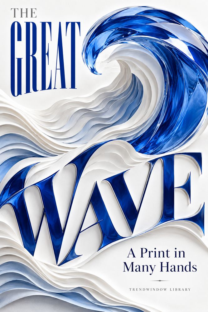
Front cover of The Great Wave: A Print in Many Hands

History & Culture

The Great Wave: A Print in Many Hands

By TrendWindow Library

Explore Hokusai’s Great Wave through design, carving, blue pigments and printing: a sourced short history of collaboration, impressions and later editions.

Read this complete edition, including its ending and notes. No purchase is required.

1. The Mountain Inside the Wave

A great wave commands the name of Hokusai's print, yet a mountain gives the series its subject. The Metropolitan Museum of Art catalogues Under the Wave off Kanagawa, commonly called The Great Wave, as part of Thirty-six Views of Mount Fuji and dates it to about 1830–1832. Its description draws attention to the distant mountain appearing small within the curve of the wave. The medium is a woodblock print: ink and colour on paper. [1]

Those few catalogue facts open several different ways of looking. A design is not necessarily one unique sheet. The name most viewers remember is not the complete title. A mountain can hold a composition's larger purpose without occupying its greatest area. Knowing what kind of object we are discussing changes the questions we ask of it.

This short cultural history follows one question through to its conclusion: how did a work associated so strongly with one artist depend on many kinds of work? It moves from the catalogue to production, from blue pigment to the difference between an impression and a later edition. It does not attempt to tell the entire history of Japanese art.

The word hands in the title is not a claim to identify every person who touched an original sheet. Some participants remain unnamed. It is a way to keep their skilled work present in an account whose most familiar name is Katsushika Hokusai.

There is no invented scene in which he watches a storm and suddenly conceives the image. No undocumented workshop dialogue fills the gaps. The evidence is already interesting without assigning a private thought to a historical person. A print can carry a history of decisions that is larger than a biographical anecdote.

2. A Series Had to Become a Project

The Hammer Museum's record names Nishimuraya Yohachi, also known as Eijudō, as publisher of its impression. [2] That credit gives a useful answer to a question sometimes hidden by the artist's fame: who organised a work's passage into a market?

The Asian Art Museum explains the commercial woodblock process through the distinct roles of publisher, designer, carver and printer. The publisher assessed a market, commissioned a design, oversaw production and arranged distribution. [3] These are functions in a production system, not a recovered account of every conversation behind this particular sheet.

Consider the difference between deciding that an image should exist and deciding how a project will reach its audience. The first sounds like a moment of inspiration. The second includes commitments: other people must be engaged, materials prepared and finished work distributed. Neither question makes the other unnecessary.

A publisher's name is therefore more than a business footnote. It keeps part of the work's organisation visible. At the same time, recognising that role does not entitle us to invent a precise budget, contract or argument that the consulted evidence does not provide.

This distinction helps a reader avoid two easy simplifications. One imagines an artist alone doing everything. The other reduces the artist to a decorative name attached to a commercial product. Collaboration requires neither extreme. A design can be Hokusai's while its physical realisation also depends on other people's decisions and skills.

Before a viewer meets a finished print, a project has already had to connect intention with means. The image's apparent unity does not mean its production had only one authorial action.

3. Lines That Were Not Merely Copied

A drawing and a printed line are related, but they are not the same material thing. In the process described by the Asian Art Museum, the design was transferred to wood; the carver removed wood around the lines, leaving raised areas that could receive ink. A printer then brought paper into contact with the prepared block. [3]

Japan Arts Council's educational account makes an important distinction: nishiki-e, multicoloured woodblock prints, were works created through collaborative production, not simply reproductions of an original picture made elsewhere. It describes the artist's design, the carving of blocks and the printer's handling of colour as contributions to that work. [4]

The distinction changes what the word original asks us to consider. If the intended work is a print, an impression does not become artistically secondary merely because another impression can be made. The repeatable process belongs to the medium. It is not proof that a painting must be hiding behind it as the only real work.

A carved line also requires interpretation through material. A graceful shape in a design must survive a different procedure before ink can carry it onto paper. Calling that step copying can make the labour sound automatic. The descriptions instead help us recognise a skilled transformation.

This book does not assign a name to the original carver of The Great Wave. A general description of a trade cannot supply a missing individual's identity. Nor does appreciation require an invented anecdote about a tired hand or a damaged block.

We can acknowledge a contribution without pretending to know its whole biography. That is one of the useful disciplines of cultural history: the unknown name should remain unknown, but the necessary work should not disappear with it.

4. The Blue Was Also Work

Marco Leona's 2020 account for The Met describes scientific investigation of The Great Wave's colour. The analysis identified indigo and Prussian blue in combination, rather than a simple replacement of an old pigment by a new one. It also explains successive printing that deepened areas of blue and produced differences in the paper's surface. [5]

The finding moves attention from a colour's name to its handling. Saying a work uses Prussian blue is useful, but it does not explain every dark and bright relationship in a finished impression. Material and method work together.

For an ordinary viewer, that distinction offers a practical way to slow down. Instead of treating blue as one uniform field, we can ask where it changes in intensity and what those changes do to the image. This is a viewing question, not a claim to have performed spectroscopy through a screen.

A scientific account does not mean the image becomes only a laboratory specimen. It can sharpen appreciation of the visual result by showing that effects were made through operations. Nor does the account tell us every printer's private reason for every choice. Evidence of a process and knowledge of an individual's intentions are not identical.

Leona also places the publisher's advertisement for the Fuji series at the New Year of 1831. [5] The advertised project and the examined material belong to the same history, but they answer different questions. One situates production publicly; the other helps explain a sheet's physical character.

We do not need to make the pigment a magical ingredient. The more interesting account recognises what people did with it. A substance could become an effect through preparation, alignment and repeated contact between block and paper.

5. One Image, More Than One Sheet

The Met records its impression as object JP1847, approximately 25.7 by 37.9 centimetres. [1] The Hammer records a different sheet, accession 1965.30.26, with its own measurements and collection credit. [2] Two museum records can refer to the same design without describing one physical object held in two places.

This sounds obvious until an online image makes every appearance seem interchangeable. A search result may lead us to a familiar composition, while the catalogue underneath identifies a particular sheet. The object number is not unnecessary clutter. It tells us which material example a statement concerns.

An impression, in this context, is a sheet produced through printing. The design is the organised image that can appear in different impressions. A digital reproduction is another presentation of an object or design, not the physical paper itself. Keeping those levels distinct makes comparisons more intelligible.

Suppose a reader sees two versions with different colour balances. The sensible first step is not to declare one fraudulent or one definitive. Establish which objects and records are being compared, and whether the pictures have comparable capture conditions. This book is not offering remote authentication or a purchasing appraisal.

The point is smaller and more useful. A familiar image can have a material identity that a small screen does not immediately disclose. Description, attribution and object number let us ask better questions before judging the apparent difference.

The history of a print is consequently neither one isolated sheet nor a limitless cloud of identical pictures. It includes a design and particular objects whose records deserve attention.

6. Making It Again Does Not Make It Old

A modern workshop offers another way to understand that distinction. Mokuhankan's own catalogue describes its Great Wave edition as originating in an autumn 2014 project. It names David Bull as carver and Chiharu Kawai as printer, with Hokusai credited for the design. It explains that the image was retraced from a Met example and carved into new wood. [6]

These credits are not the names of the unidentified nineteenth-century workers. They belong to a later edition. The workshop's openness about its process makes that difference clear rather than requiring the reader to guess.

A new woodblock print based on an earlier design is also not the same thing as a digital poster. But being made by hand does not turn it into an impression produced during Hokusai's lifetime. Technique and date answer different questions.

That separation leaves room to appreciate later craftsmanship honestly. A contemporary carver can perform demanding work without borrowing an earlier date. A printer can make a carefully registered impression without the paper becoming historical evidence of an original publisher's workshop.

This account does not endorse a sale, report present stock or quote a current price. The primary workshop record is used to explain declared provenance and the attribution of separate roles. It is not a purchasing recommendation or proof that every later product is equally described.

There is no need to arrange all objects in a simple ladder from valuable to worthless. First understand what each is. A design, an early impression, a later recutting and a photograph can all be interesting, while remaining materially and historically different.

7. Fame Can Hide a Useful Question

The phrase Hokusai's Great Wave is convenient and meaningful. This account does not propose abandoning it. What matters is whether the phrase ends inquiry or begins it. An artist's name can identify a work without accounting for everything that made a sheet possible.

The consulted institutional accounts give us roles, object records and material analysis. Those kinds of evidence do not merge into one complete workshop diary. Treating them as complementary helps preserve both their usefulness and their limits.

A reader can practise a small sequence of attention. First identify the design and its series. Then read the medium and object record. Finally ask what the description reveals about making, printing and the particular example under discussion. These are interpretive steps, not a specialist authentication procedure.

The sequence also interrupts the habit of treating recognition as understanding. Knowing an image immediately can feel like having exhausted it. Yet recognition tells us chiefly that a form has become familiar. It does not by itself explain a block, a pigment mixture, a printer's work or a museum's object number.

There is a further caution about representing a culture through one image. This book's narrow subject is a particular print and the labour behind it. It cannot make that print a complete account of Japanese people, art or historical experience.

A focused history is stronger when its scale stays visible. It can make one familiar object more substantial without claiming that all the surrounding history has been contained.

8. Returning to the Small Mountain

We began with a mountain that appears small inside the image remembered for its wave. The catalogue kept the series in view; the production accounts kept the collaborators in view. By following those connections, the familiar title acquired more than a famous artist and a striking shape.

The journey did not recover every name or every workshop decision. It established useful distinctions. Design is not identical with one impression. A printer's material operations are not an incidental final touch. A modern recutting is not an early sheet simply because both were printed from wood.

These distinctions do not take pleasure away from looking. They give it somewhere to go. A line can invite attention to carving, a blue area to printing, and a catalogue entry to the particular object that carries them.

The many hands of the title therefore return us to the work, rather than replacing it with a list of trades. Their actions converge in an image a viewer can experience as a whole. The unity belongs to the result; it need not erase the collaboration behind it.

This is the end of a complete short cultural history, not the end of research on The Great Wave. A reader who next encounters it can pause before the instant of recognition closes. There is a mountain inside the wave, a sheet beneath the image and work behind the name. Looking for those relations makes the familiar encounter a fresh one.

Sources and Edition Information

Research checked on 1 November 2026. Original AI-assisted short cultural history by TrendWindow Library. Eight chapters and these notes form nine fixed content units, not printed pagination. No historical dialogue, private intention, workshop visit, laboratory experiment or authentication is invented. Original interpretive connections are distinguished from short sourced findings. No original print, museum photograph or third-party image is reproduced. Covers are original conceptual English artwork, not reproductions of Hokusai's composition or technical demonstrations. No human-authorship or independent native-human proofreading certification.

[1] The Metropolitan Museum of Art, Under the Wave off Kanagawa, object JP1847: https://www.metmuseum.org/art/collection/search/45434 . Main description and object information read for title, series, approximate 1830–1832 date, medium, mountain relationship, object number and dimensions. No current visitor-access promise, audio-transcript review or inference that every impression has the same measurements.

[2] Hammer Museum, Under the Wave off Kanagawa, accession 1965.30.26: https://collections.hammer.ucla.edu/artwork/1965.30.26 . Main object fields read for distinct sheet, approximate date, medium and Nishimuraya Yohachi/Eijudō publisher credit. Other claims on the page about pigment and blocks are not used to establish a universal mechanism or exact production total.

[3] Asian Art Museum, The Ukiyo-e (Woodblock) Printing Process: https://education.asianart.org/resources/the-ukiyo-e-woodblock-printing-process/ . Main process sections read for publisher, artist, carver, printer and the general transfer from design to block and paper. General production descriptions are not presented as an eyewitness account of this specific workshop or an exact Great Wave print-run count.

[4] Japan Arts Council, What are Nishiki-e?: https://www2.ntj.jac.go.jp/dglib/contents/learn/edc25/en/woodblock-prints/nishiki-e.html . Sections on collaborative production read to distinguish original printmaking from reproducing a separate original picture. No full survey of all Japanese printmaking traditions is claimed.

[5] Marco Leona, The Great Wave: Anatomy of an Icon, The Metropolitan Museum of Art, 10 April 2020: https://www.metmuseum.org/essays/hokusai-great-wave . Main research explanation read for the 1831 advertisement, indigo/Prussian-blue combination, successive printing and surface differences. No repeat laboratory work or independent analysis of every impression; specific examined evidence is not a formula imposed on all editions.

[6] Mokuhankan, The Great Wave, catalogue item 0293: https://mokuhankan.com/catalogue/item_page.php?catalogue_number=0293 . Workshop's declared edition origin, process and named carver/printer credits read as primary testimony about its own later work, not an independent authentication of an early impression. No transaction, stock or price recommendation.

Brief source paraphrases support an original interpretive narrative. A limited exact-title search found no matching title among returned results, not exhaustive clearance or a plagiarism percentage. Full translations preserve the argument, its ending, source scopes and attribution distinctions. All covers remain in English.

Explore more books →